Here are my three different logo choices! Some things that I kept in mind while making my logo’s was to make the imagery appropriate for my type of business. I also used a simple shape for my logo while then adding an image or paint brush over top of the words. I tried to contrast color between the words and the paint brush or image that I chose. My favorite of the three is the second logo!
Blog Post #8
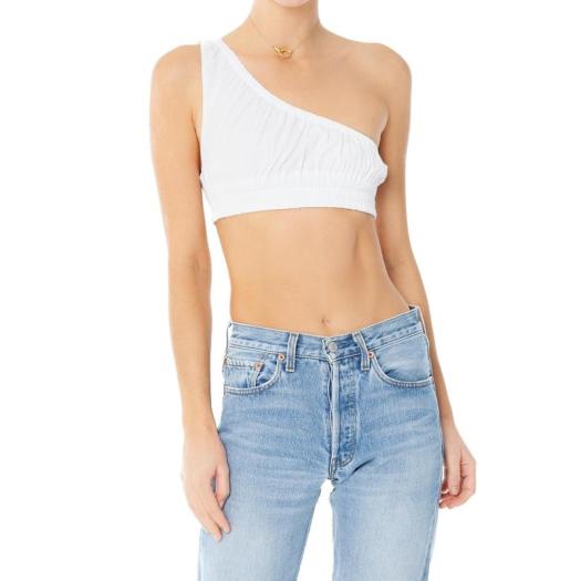
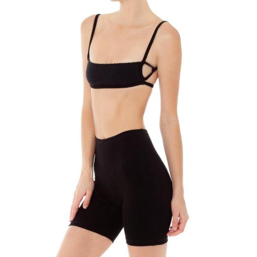
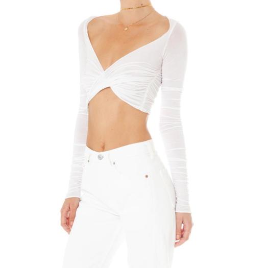
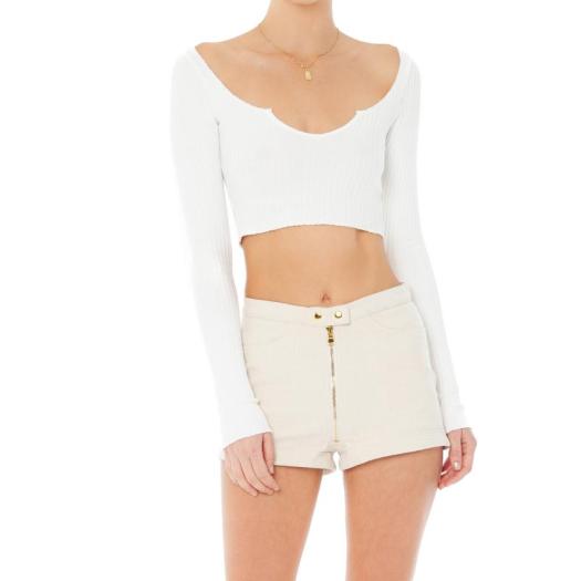
These are the four styles that I want to update in some way and will work with my patterns. I would update the style of the first top by adding a bit more fabric and padding so that this can support a woman while she is working out. I love the one strap idea and think it could be incorporated into athletic wear somehow and put my pattern all over it. For the second style I would add more fabric at the top so that no one is spilling out of the top when they run on the treadmill. I might keep the black body and add my design patterns to the straps. For the third style I would shorten the sleeves or make them a bit looser, it’s a petty breathable fabric but just want to make sure no one sweats too much through it. For the last look I would update the style by maybe making it a bit longer and then adding my pattern to either the entire shirt or the outline edges to give it some contrast. I chose pieces that I already sort of liked and could see becoming cute athletic wear in the future.


Blog Post #7
- Static noise created from a computer have been on the come up, mix and matching, monochrome, street wear has also became more professional and elegant by designers redesigning their logos to create some edge, bright colors are very popular right now which is very relevant to my brand
- Three trends that align with my brand are bright colors, lightweight fabrics, and gender neutral designs!
Blog Post #6
The culture that I’ve chosen is Japanese culture.
- Five new things I learned about the culture:
- There are two main religions, Shinto and Buddhism
- There are subtle changes in the gender gap in Japan but it has a long way to come
- Children are the center of the family
- Comic books and animations became really popular here
- Traditional arts like the tea ceremony, flower arranging and dance that express Japan’s cultural heritage are greatly valued
- Japanese embroidery (nihon shishu) uses silk and metal threads, this kind of embroidery is used on kimonos and other textiles
- The only common theme is bright colors, red, silk fabrics and many unique shapes within the garments
- They use a lot of reds and vibrant colors to make silk patterns pop out
Blog Post #5
The clothing brand that I chose was ARE YOU AM I. I chose this brand because they seem to be incorporating a lot of recent trends into their clothing, but still keep them simple and good materials. If I had the money I would probably buy the whole website, they’ve just got the best quality basics that everyone needs. The brand is doing pretty well for itself, having many models wear their clothes is basically free promotion. Here are a few images of the brand.
Blog Post #4
Blog Post #3
When I went outside and looked around I saw many things. It was beautiful out so I was walking around for a bit before I had to go to work. While I was walking around I noticed the cool texture of the coat that I was wearing, felt the soft, supple texture of the pretty flowers while passing by, and stopped by my sorority sister’s house and noticed the wood texture on our letter’s that she had standing up. When I was going to work later that day I saw many different people, including the guy who dressed surprisingly nice for going to classes. I passed by a big cop car, and was stopped at the Oliver building on main street for a while because of the fire trucks that were called at the time. I wouldn’t have noticed a lot of these thing’s and realized how much stimuli I come in contact with on a daily basis.
Color Relationships ( Blog Post #2)
The color relationship that I chose to focus on is the analogous relationship which is a combination of three colors next to each other. The specific colors I chose on the wheel are violet, blue-violet, and blue. This color relationship appealed to me the most because I love gradients of different colors going into other colors, therefore they would need to be next to each other. These colors give me a lot of emotions like calm, stability, luxury, icy, sultry, and melancholy.
Blog Post #1

I’m a very hardworking, trustworthy, and dedicated person. I tend to doubt myself a lot on my creative abilities because I never associated loving fashion with being artistic. I couldn’t ever design anything or think of something new and innovative throughout my life. I also tend to stay in my comfort zone quite a lot so I’m making new goals this year to step out of that mindset and really start living. I love styling and creating a beautiful artistic fashion picture in the end of a project!


